The Night I Met the Prince
Some moments don’t seem significant at the time, but they quietly shape what comes after.
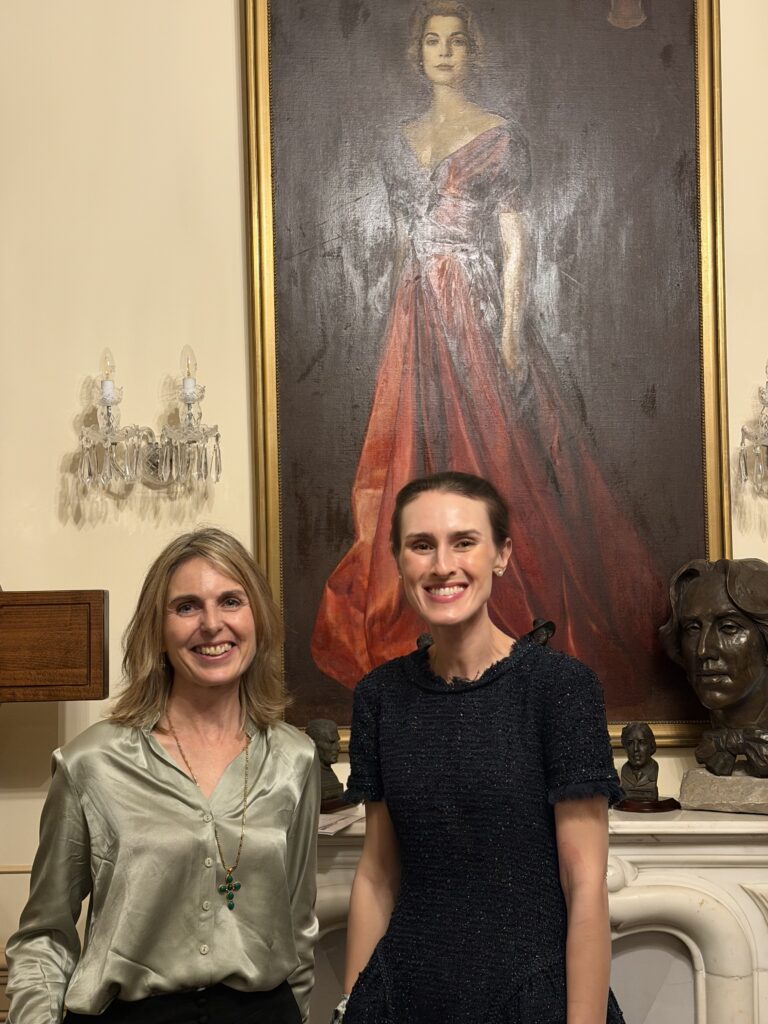
My first visit to the Princess Grace Irish Library in Monaco was out of curiosity. I was on an extended trip in the French Riviera, immersing myself in Princess Grace’s life and history. Founded by Prince Rainier III to honor her Irish heritage, the Library houses her vast collection of Irish literature and Irish-American sheet music, along with portraits of her by Irish artists such as Jack Yeats and Louis le Brocquy. Her presence is felt everywhere.
Princess Grace’s roots in Ireland were deeply important to her. In 1961, she and Prince Rainier returned to her ancestral land in County Mayo on what became the first official state visit by a head of state since Ireland’s founding.
I later discovered that my own family emigrated to America from County Mayo, just a few miles from where her family originated, which made the connection feel unexpectedly personal…
On my first visit to the Library, I met its wonderful director, Paula Farquharson, who noticed me holding one of my Grace Kelly notecards and asked about my artwork. Since then, Paula has been an advocate, generous with her time, introducing my work to Princess Grace’s son, H.S.H Prince Albert II of Monaco, and to the Library’s trustees (one of whom was personally friends with Princess Grace).
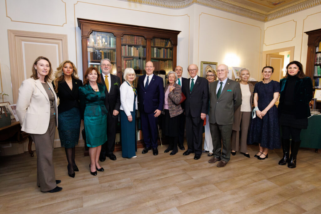
The Library hosts an annual St. Patrick’s Day celebration, an evening of Irish music, literature and cultural exchange that draws members of the Irish government and Monaco’s Irish community, as well as the Prince himself. This year, an exhibition of artwork inspired by Princess Grace was included in the evening. Library trustee Mark Armstrong, formerly a senior director at Sotheby’s Monaco, displayed 40 paintings of Monaco landscapes. Stefne Van Zyl, the palace portrait artist behind a recent release of official Monaco stamps featuring Princess Grace, also unveiled a new pastel portrait.
Paula emailed me to ask if I would present my work as well. She had received confirmation from the palace to display and present my illustrations to the Prince at the event!
“I’m delighted for you,” Paula wrote. “And also for us, as your illustrations will add a beautiful, nostalgic touch and make the connection with the young, creative Grace Kelly. We are honored to have your illustrations on display for the event, and they will continue to be on permanent display thereafter.”
A surge of excitement and disbelief came over me. Needless to say, my husband Rich and I marked our calendars for March in Monaco.
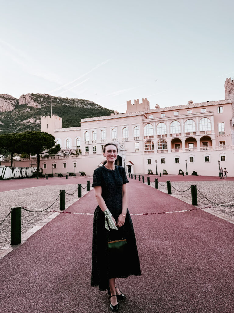
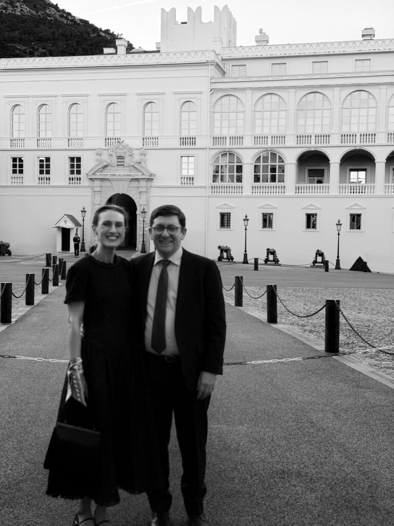
I was extremely anxious in the days and weeks leading up to the event. My illustrations for Bond & Grace’s upcoming Pride and Prejudice Art Novel (more on that later!) were due the day before our flight. However, travel was seamless and soon I was back in the French Riviera. We stayed at Hôtel du Couvent in Nice, 30 minutes from Monaco. When the time finally came to get ready, my husband turned on Rear Window to help ease my nerves. I put on my Grace Kelly-inspired dress, and we made our way to the event.
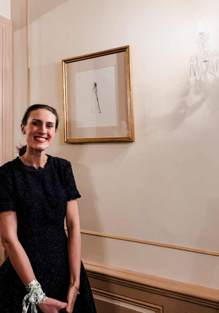
By the time we arrived, the rooms were full and the evening underway. It was lovely to see Paula again. Mark greeted me enthusiastically and led me to my illustration of Princess Grace, as it was the first time I’d seen it framed and hung. Stefne and I chatted about illustrating Princess Grace. Everyone was so warm and welcoming that it felt, unexpectedly, like coming home.
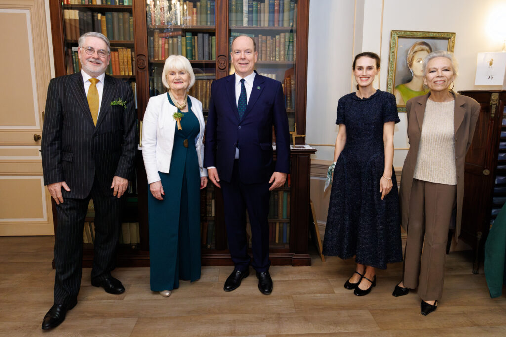
At one point, I overheard someone say, “The Prince has just left the Palace. He’ll be here in seven minutes.” There is something about a countdown like this that sharpens your awareness. The details come into focus. You begin to notice where you are standing, what you are holding, what is about to happen.
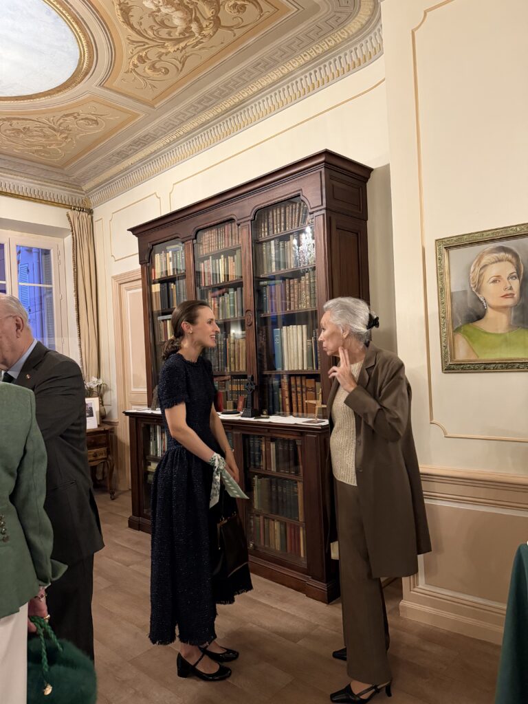
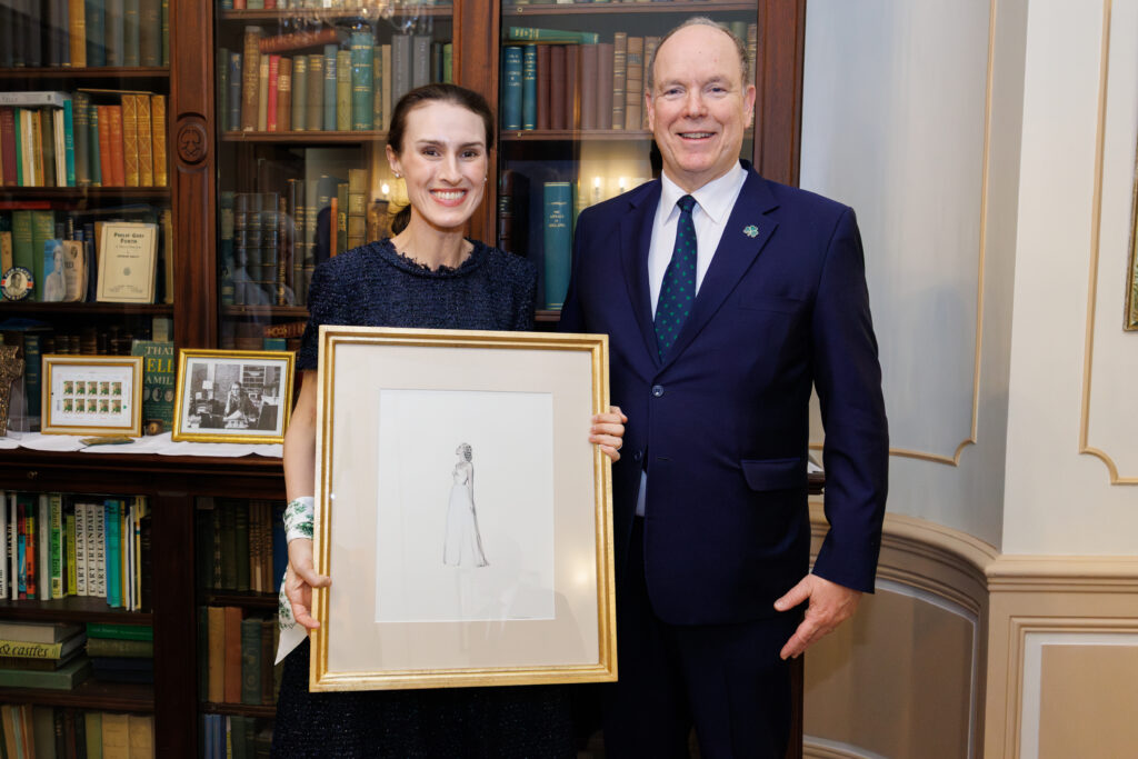
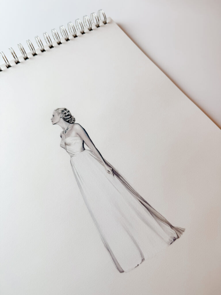
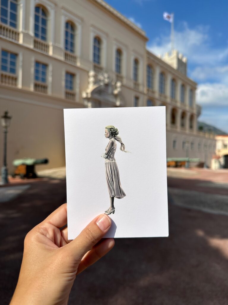
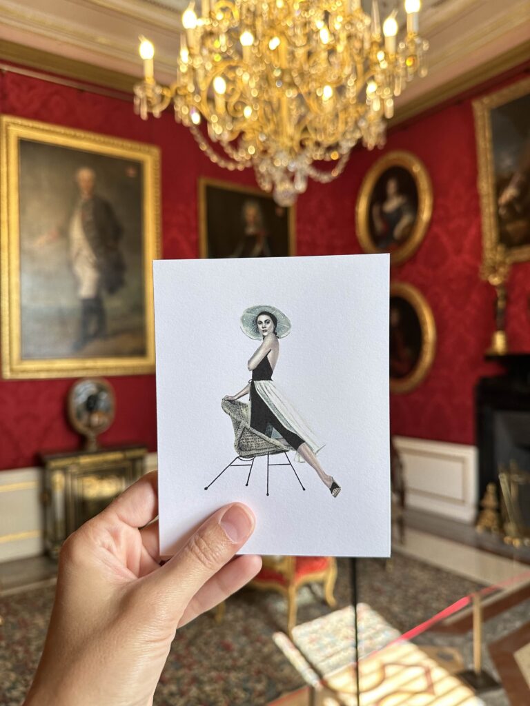
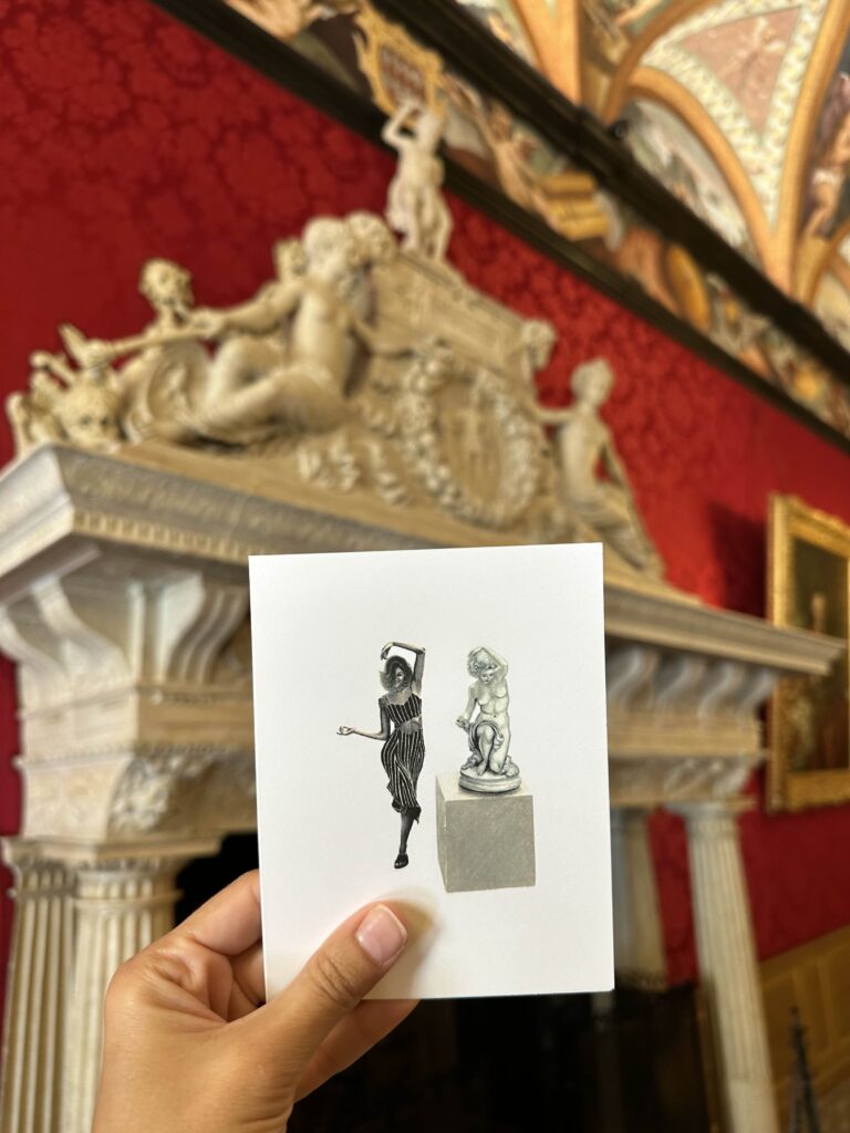
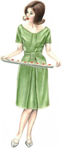
Guests were ushered into the next room. Stefne and I remained alongside Marian Harkin, Irish Minister of State, and Niall Burgess, Ambassador of Ireland to France and to Monaco, to greet the Prince in the salon. When the Prince arrived, the energy in the room shifted. Cameras flashed and my heart raced. The introductions were gracious and unhurried. When it was my turn, I presented him with my illustration of his mother, Princess Grace. It felt like a dream.
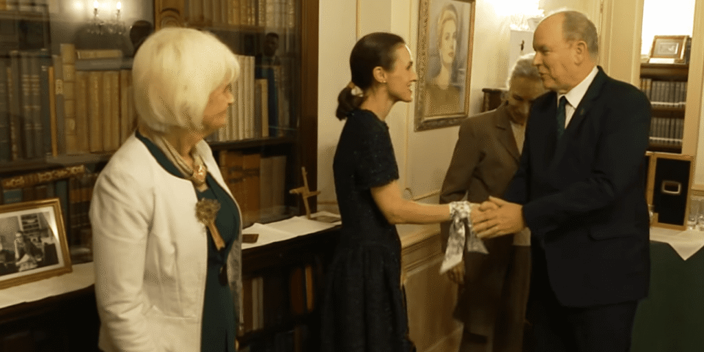
It was a simple exchange. Brief, but not rushed.
The Prince looked at the drawing and paused. “Wow. I know where this is from,” he said.
“Yes, To Catch a Thief,” I replied.
He smiled and thanked me. We stood together for a moment as a photograph was taken, the illustration between us, framed earlier that week in Monaco.
It is difficult to fully register a moment like that while you are in it. It settled into greater meaning later, with a bit of distance.
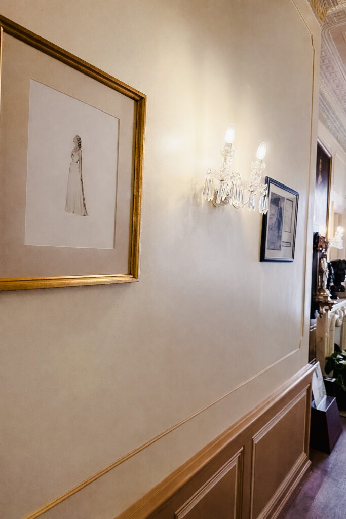
After our photographs, the Prince and others made their way into the next room, where Irish music was to be played, and I was left momentarily alone in the salon to place my framed piece of art back on the Library wall, where it now hangs permanently. I admit I had to catch my breath a bit.
There was something quietly surreal about that. Not just the meeting itself, but the sense that my artwork had found its place. That it belonged there, among Monaco’s history and Princess Grace’s objects. Géraldine, who has worked at the Library for 25 years, said to me, “Your artwork is part of the Library’s history now.”
It is a rare and special thing, to see something you made enter into a larger story.
Hunt & Bloom: Tastemaker On the Hunt!

I’m so honored to be Hunt & Bloom’s first “Tastemaker on the Hunt“! My friend and collaborator, Will Hunt Lewis, asked me to choose a few of my favorite things across his lovely site, huntandbloom.com. You can browse my picks HERE! And stay tuned as more tastemakers curate their lists each season!
Thanks to Will Hunt’s incredible eye for design, Hunt & Bloom is truly a treasure trove. He manages to find the most beautiful home wares and gifts ever, making his site such a pleasure to peruse. I’m so grateful to collaborate with Will Hunt on our tea towel and tote bag collection and found such joy in taking a deep dive into his shop. I’ve included a few items from my tastemaker list below, and you can find my complete list HERE on the Hunt & Bloom site. I hope you enjoy!
Paulette Pearson x Hunt & Bloom Easy Entertaining Tea Towel III
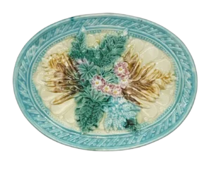
Majolica Woven Blue Rim and Floral Oval Plate
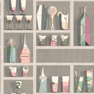
Fornasetti Cocktails Wallpaper, Pastel
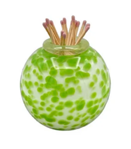
Handblown Match Strike, Speckled Green
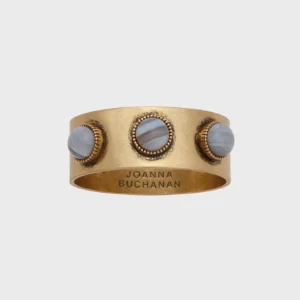
Joanna Buchanan Cabochon Agate Napkin Rings, Set of 4
French Fresco Collection is live!
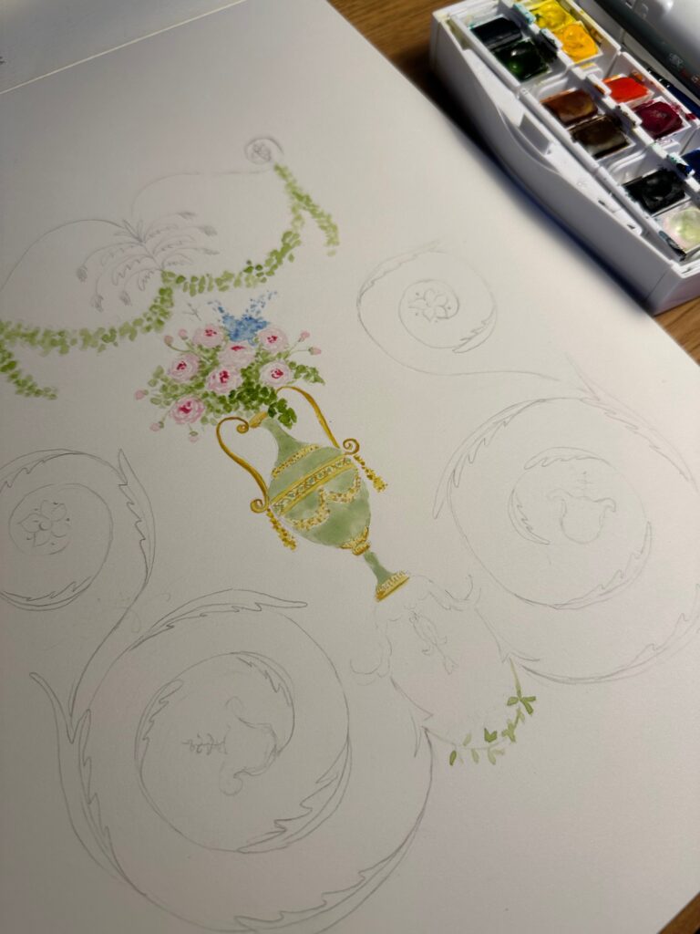
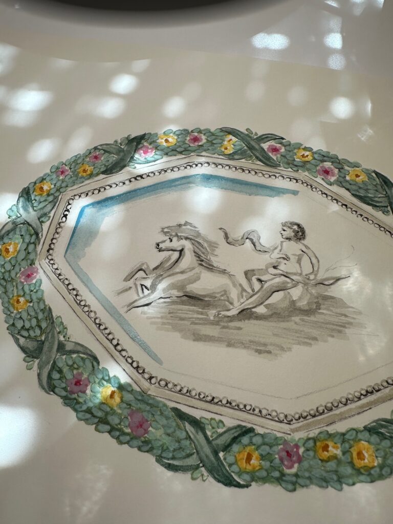
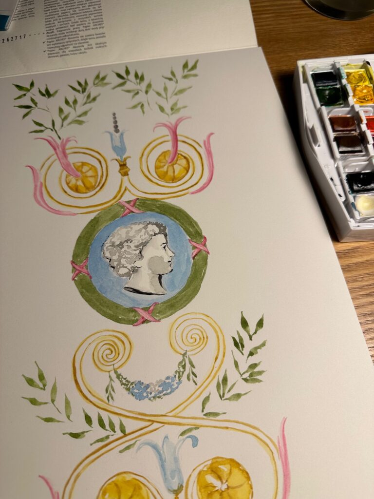
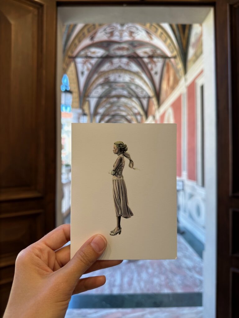
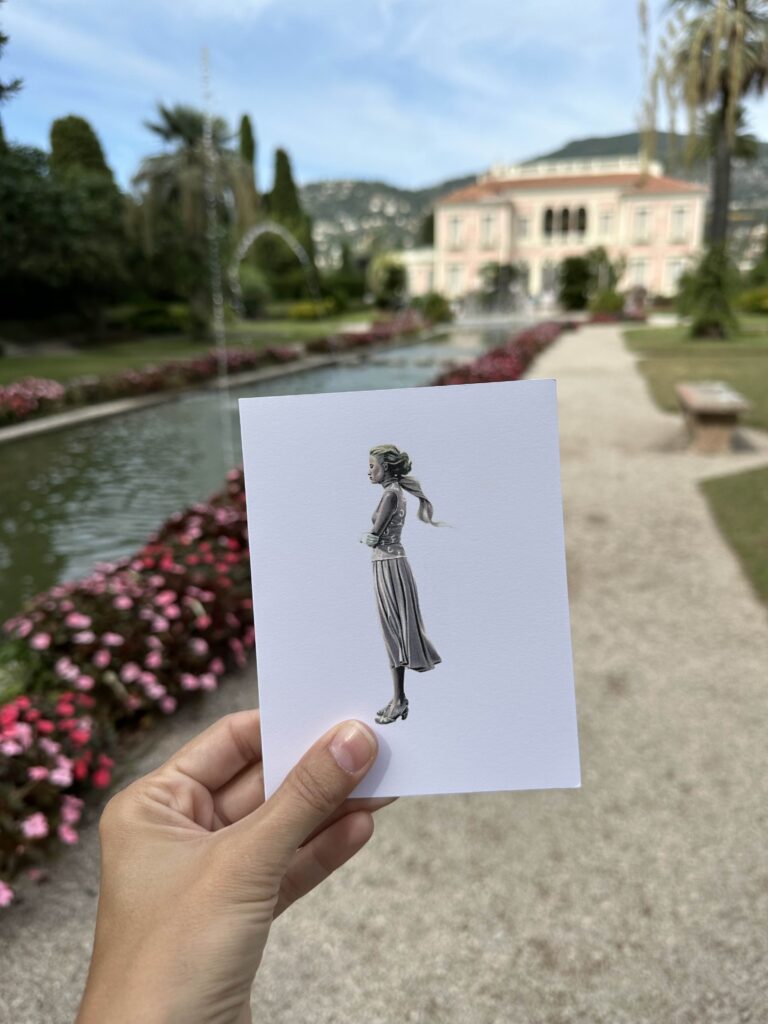
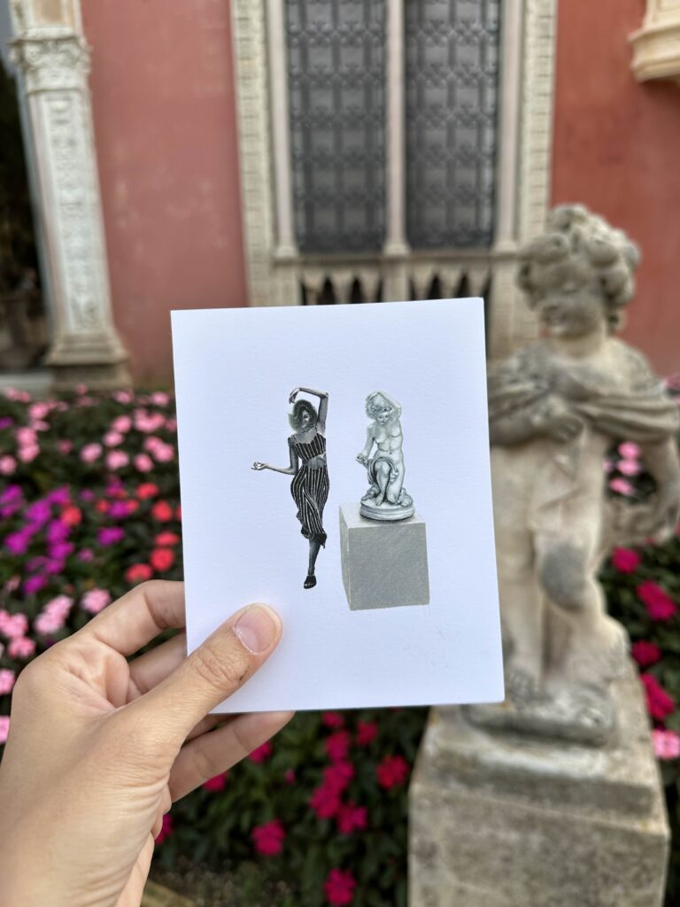
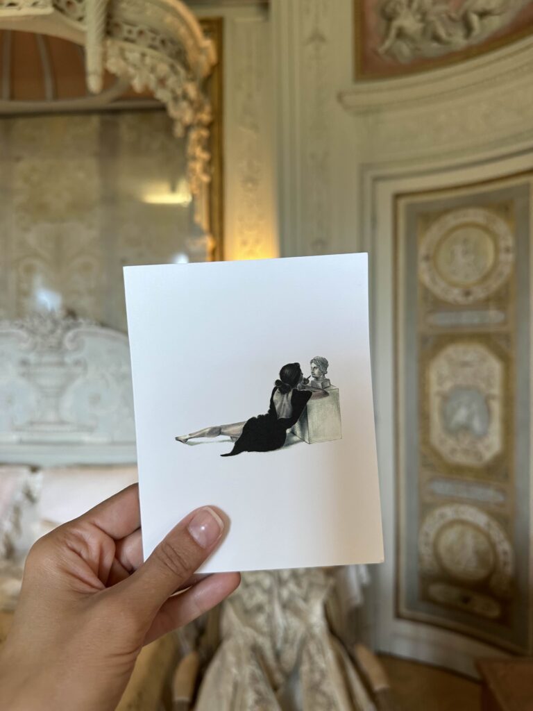
I am so excited to finally share my French Fresco Collection! In it you’ll find original watercolors, prints, notecards and gift tags, all inspired by the French Riviera.
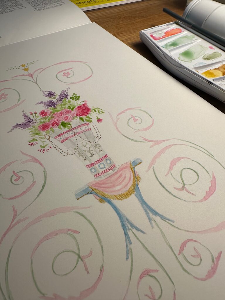
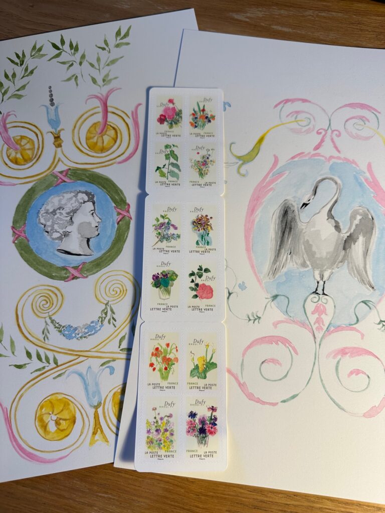
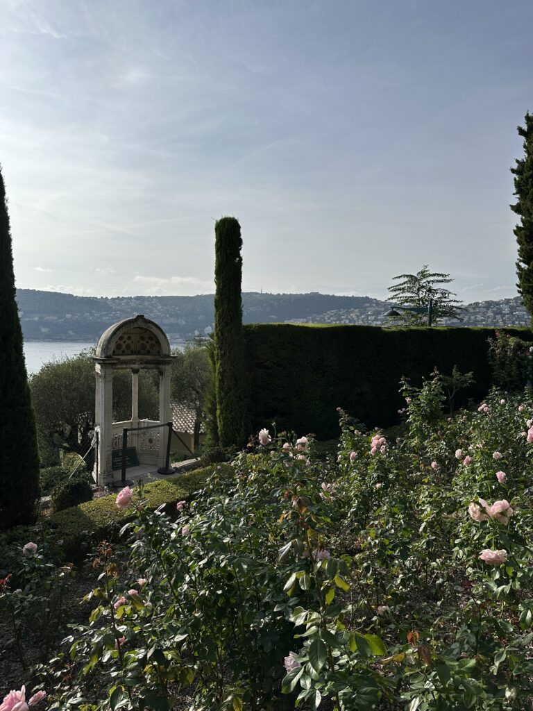
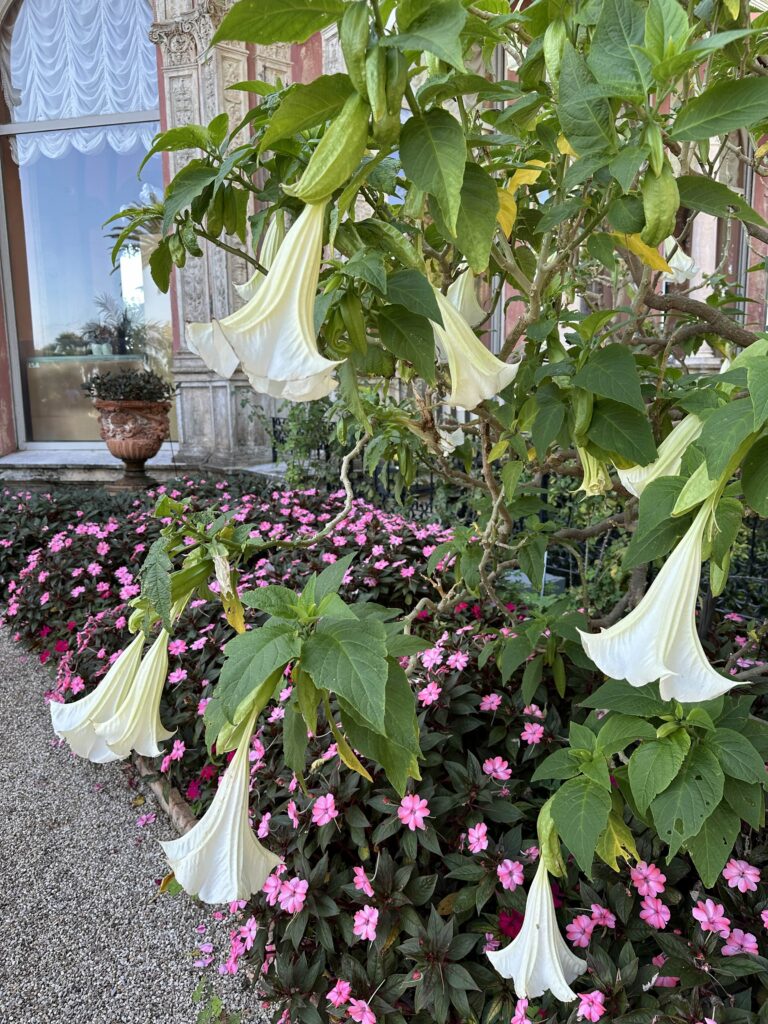
I created these illustrations during my recent three-week stay in Villefranche-Sur-Mer, near Nice. I spent my days visiting places like the famous Villa Ephrussi de Rothschild in Cap Ferret (HERE) and the Prince’s Palace in Monaco, home to Princess Grace (HERE). I snapped endless photos of the beautiful frescoes on the walls and doors. And then, in the evenings, back at my apartment in Villefranche-Sur-Mer, I stayed up late watercoloring what I’d seen. It dawned on me how beautiful they’d be as stationery and prints. And my French Fresco Collection was born!
The French Fresco Collection includes six motifs. Each is available on notecards, prints (5×7″, 8×10″ and 11×14″) and gift tags!
You can browse the entire collection and shop the originals on my web site HERE! In the meantime, I’ve gathered a few shots of the inspiration behind these pieces as well as the works in-progress below!
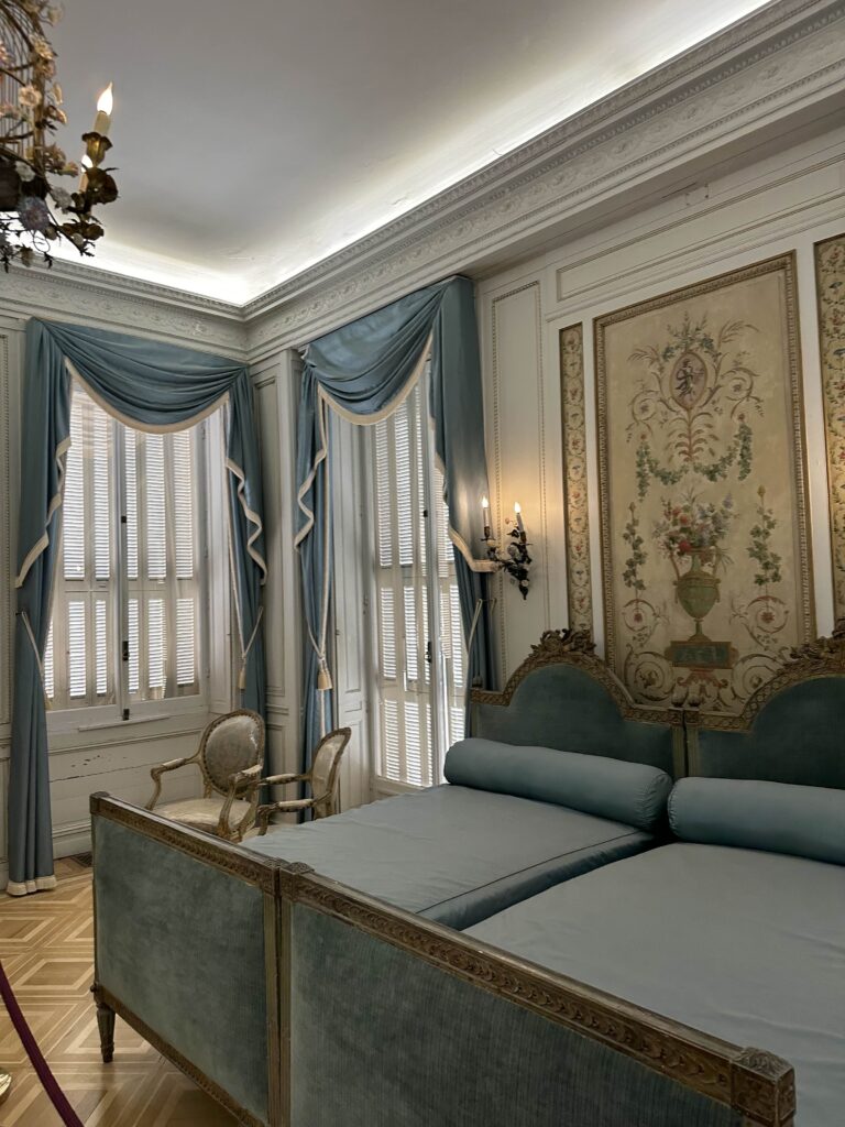
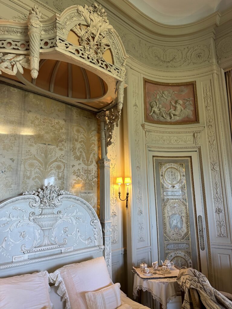
These two frescoes (above and below)) are located in the Blue Bedroom in the Villa Ephrussi de Rothschild, the villa’s most elaborate guest bedroom. The Villa Ephrussi de Rothschild is an Italian Renaissance-style home that was built for the Baroness Beatrice de Rothschild between 1905 and 1912.
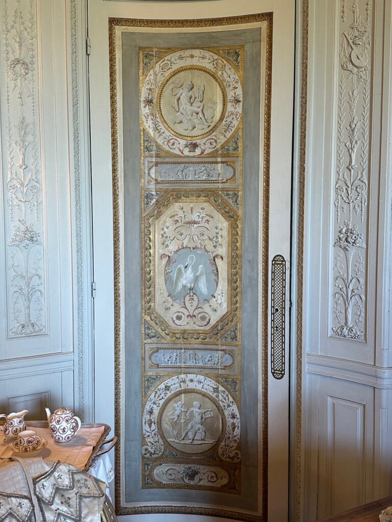
Beatrice’s bedroom (below) is furnished with a Venetian bed covered with Chinese silk embroidered with various flower and bird motifs that complement this beautiful swan fresco on a nearby door panel.
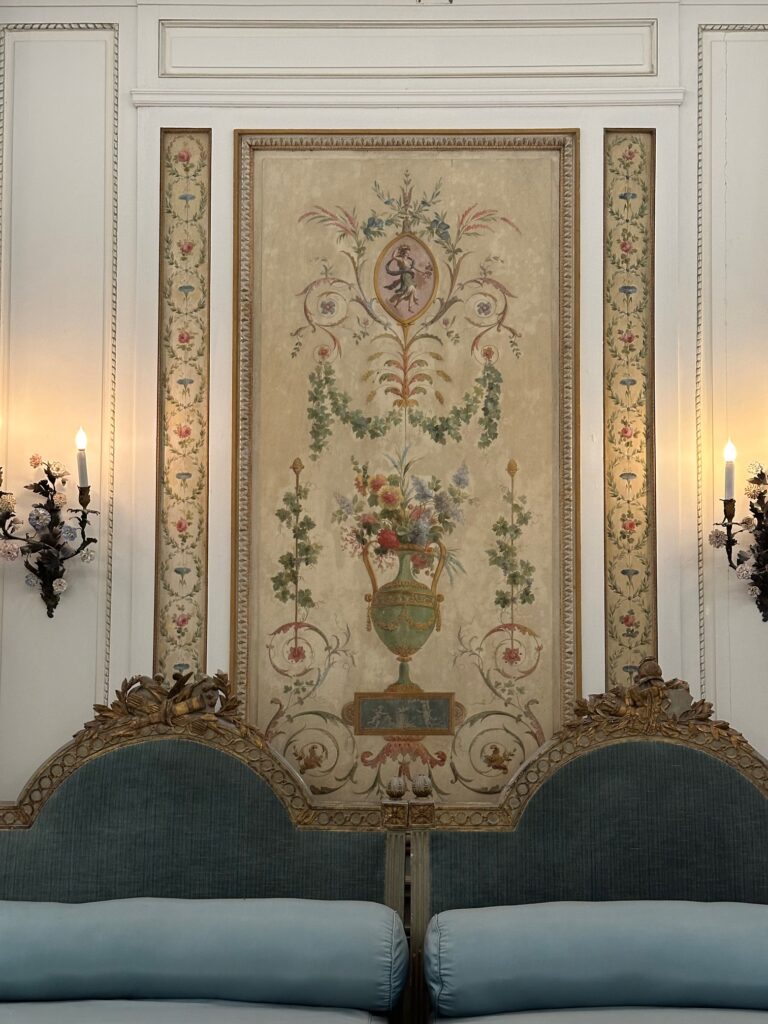
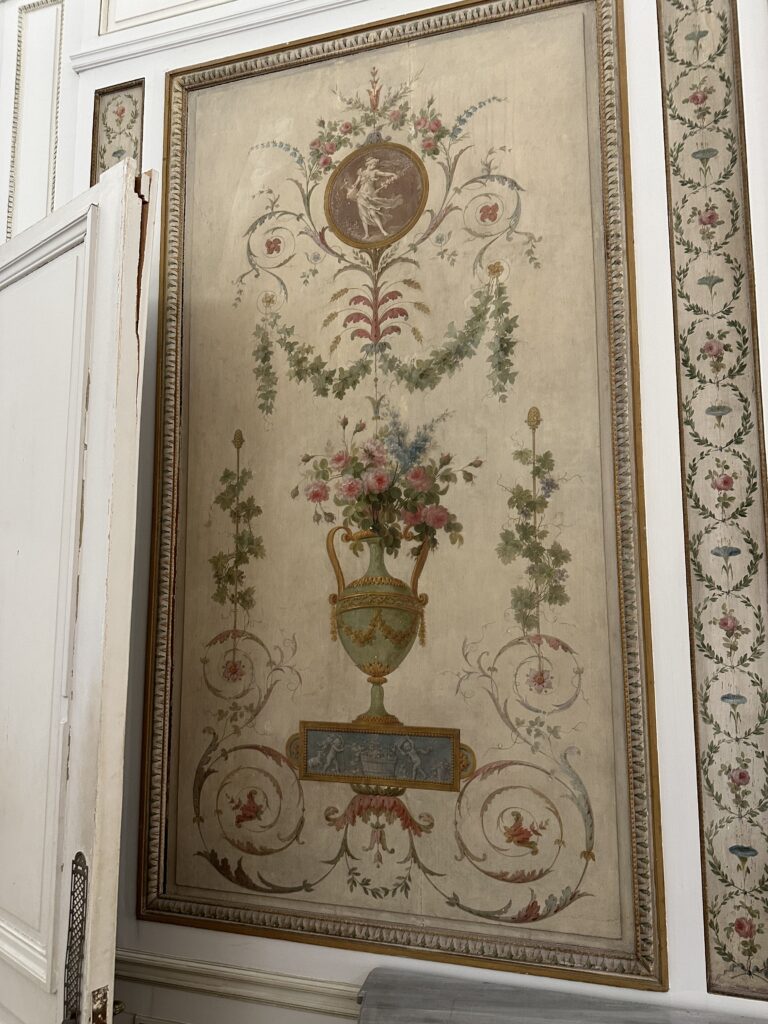
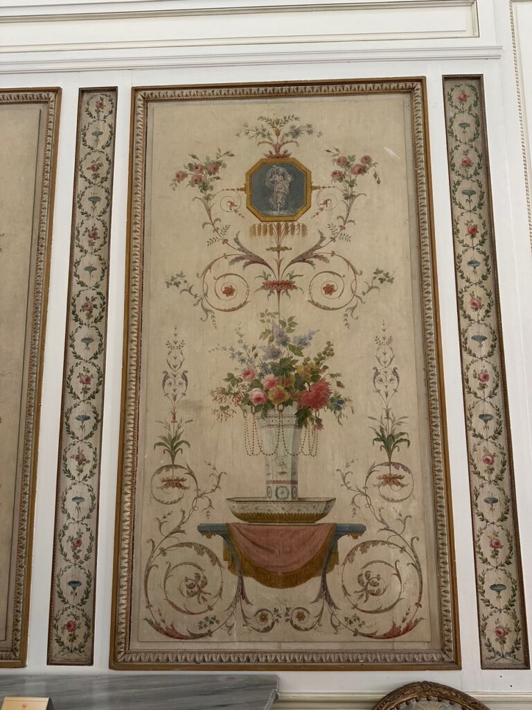
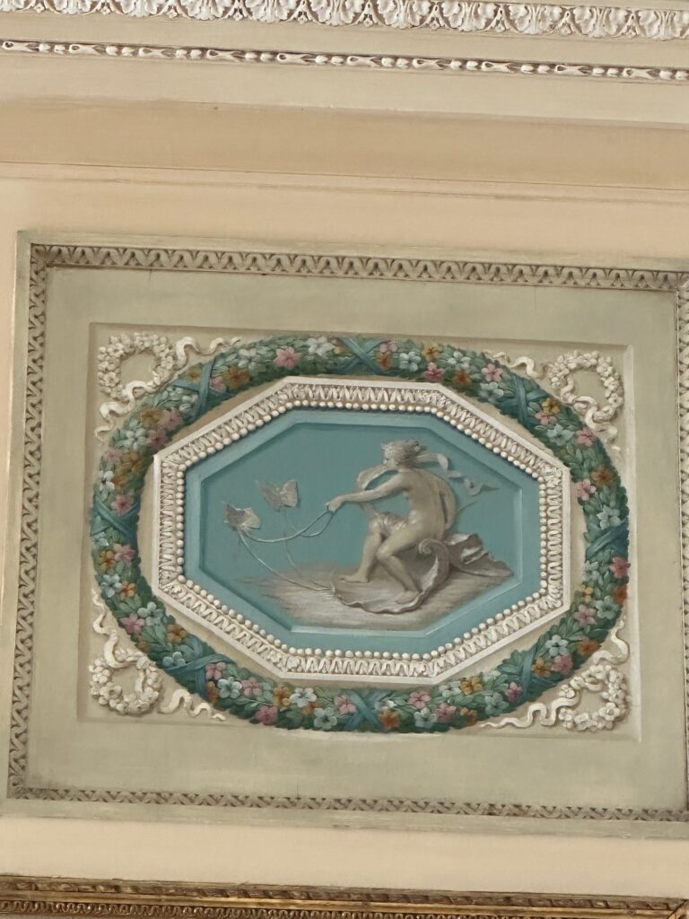
I loved these two frescoes in the villa (below) and decided to paint them after I returned to Dallas! The blue hue is so beautiful and they remind me of intaglios.
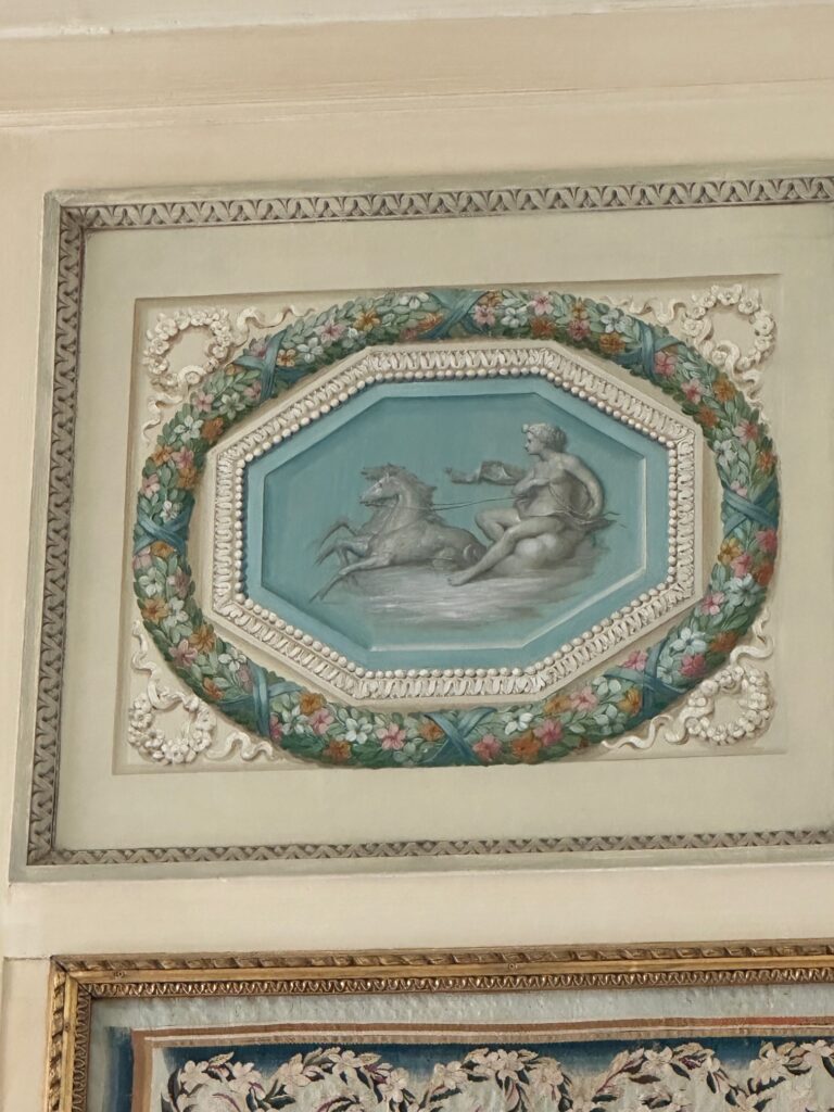
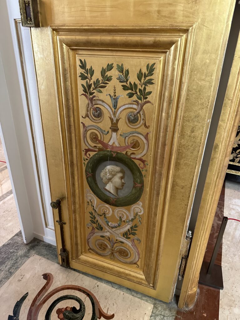
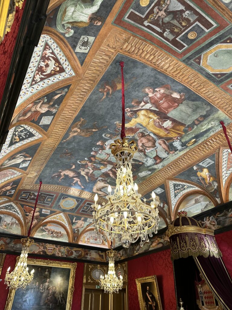
I came across this fresco (below) at the Prince’s Palace of Monaco. There are many more beautiful frescoes in the palace and I can’t wait to watercolor them all as I continue adding to my French Fresco Collection. The palace is currently undergoing major restorations of its original frescoes, one of the biggest fresco restoration projects in European history.
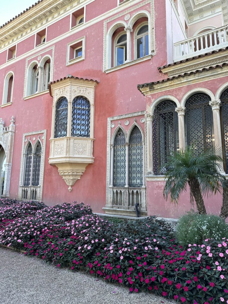
The Prince’s Palace of Monaco
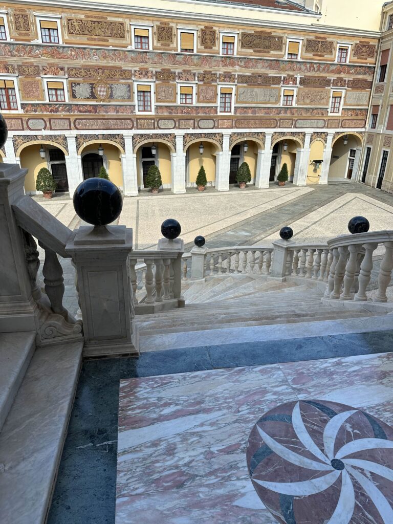
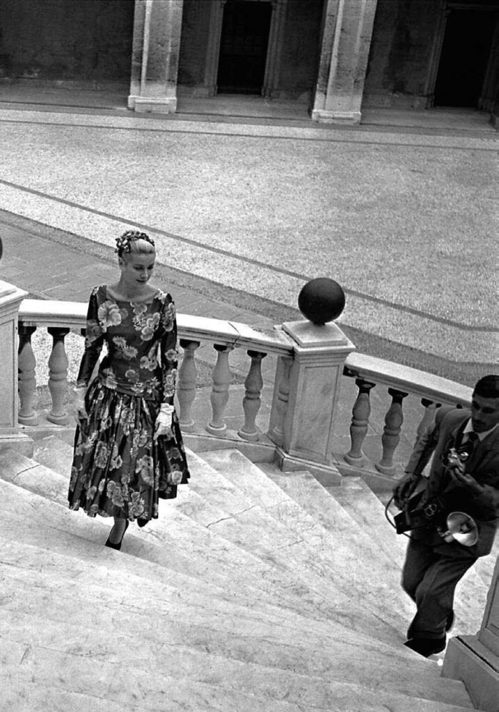
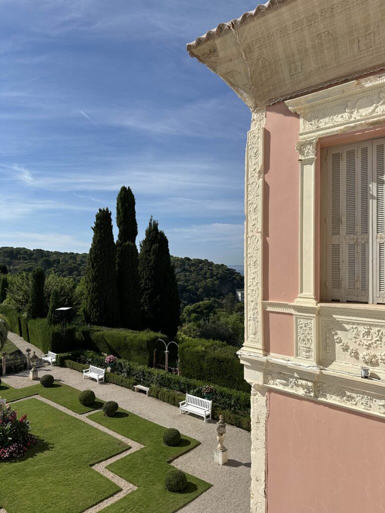
The Prince’s Palace in Monaco was a bit overwhelming emotionally (lol) as I have seen so many photos over the years of the wedding of Princess Grace and Prince Rainier. I had no idea we’d have access to the location where they had their wedding photos taken! Swoon. Look at all the lovely details in the ceiling and floor on the balcony (scroll below), and not much has changed since their wedding day in 1956!
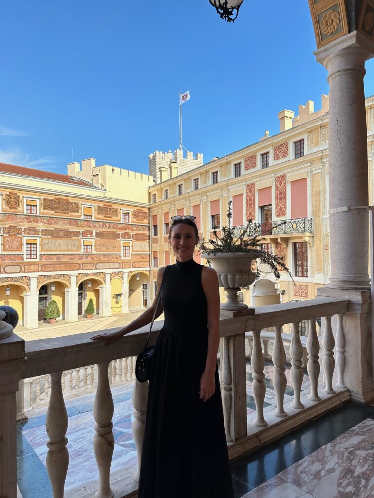
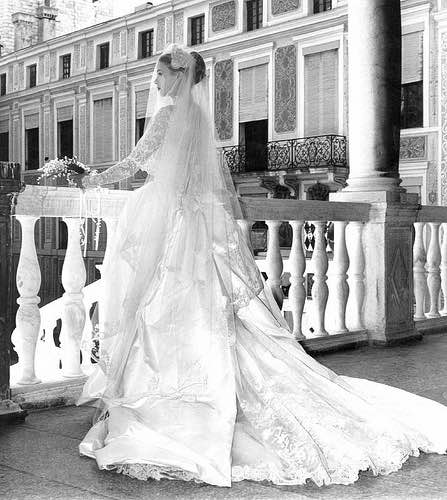
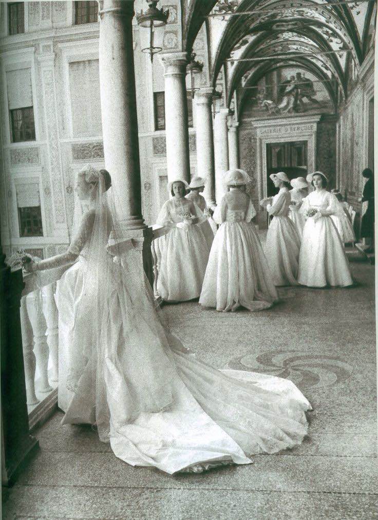
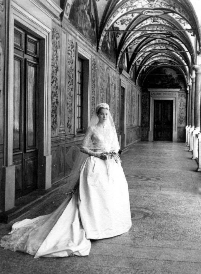
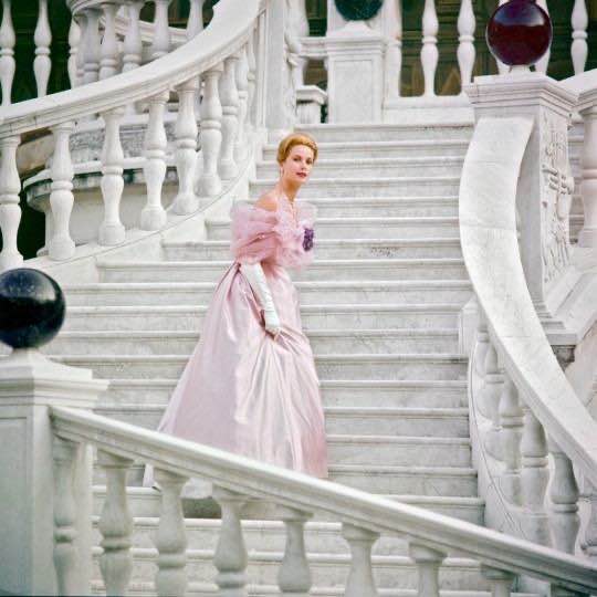
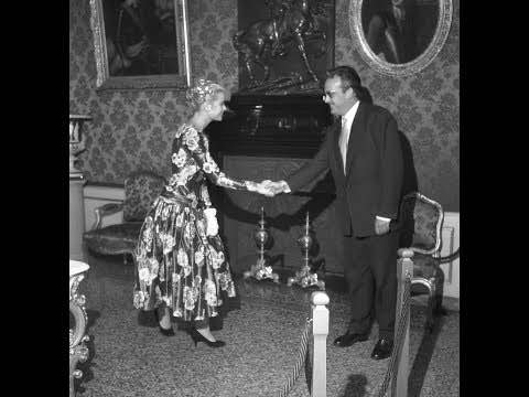
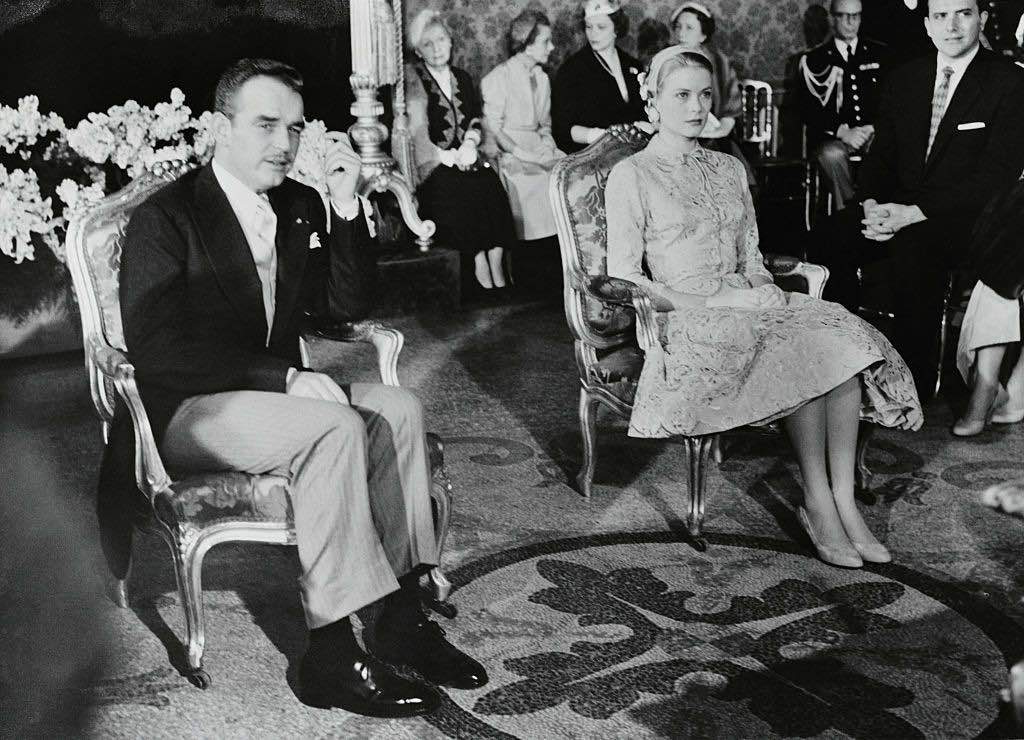
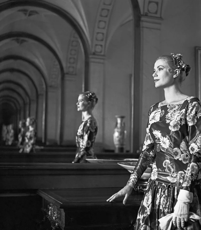
It was magical thinking of Grace at the palace and all the history within those rooms. These steps (below) are right below the balcony where the wedding photos were taken! The black-and-white photo of Grace is from the day she first met Rainier when she was visiting the French Riviera for the Cannes Film Festival. It’s a fabulous story involving Olivia de Havilland, whose husband was editor of Paris Match and recommended Grace and Rainier meet for a photo opportunity. The color photo is from after Grace and Rainier were married and has always been one of my favorites.
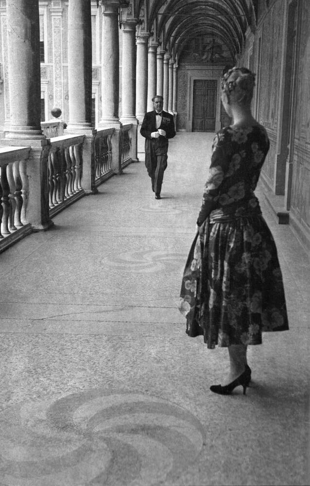
This (below) is the moment Grace and Rainier met and the space where it happened! It’s really a fun story (more than I can detail here) so I highly recommend reading about it! I believe Grace made a makeshift “hat” out of flowers because she learned at the last minute she needed a head covering of some sort to meet the prince. The room (just inside the balcony) is gorgeous and is where the prince welcomed all of his important visitors.
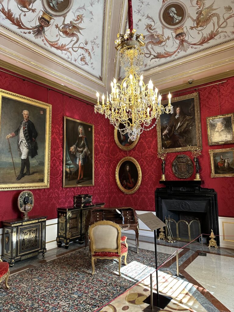
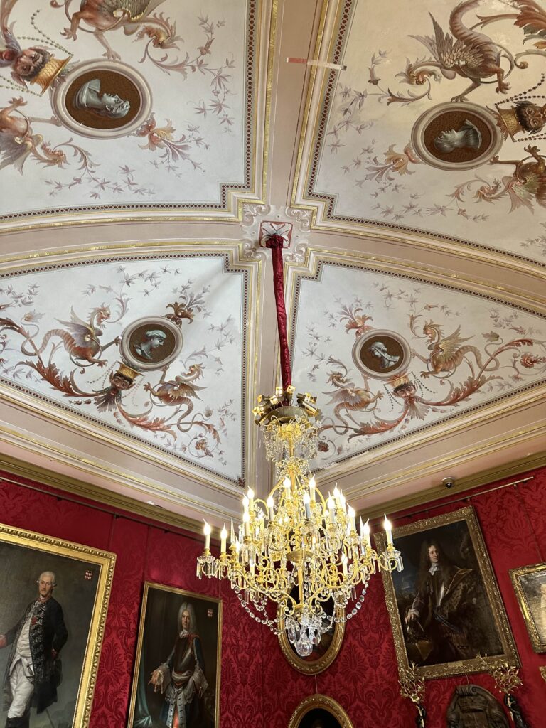
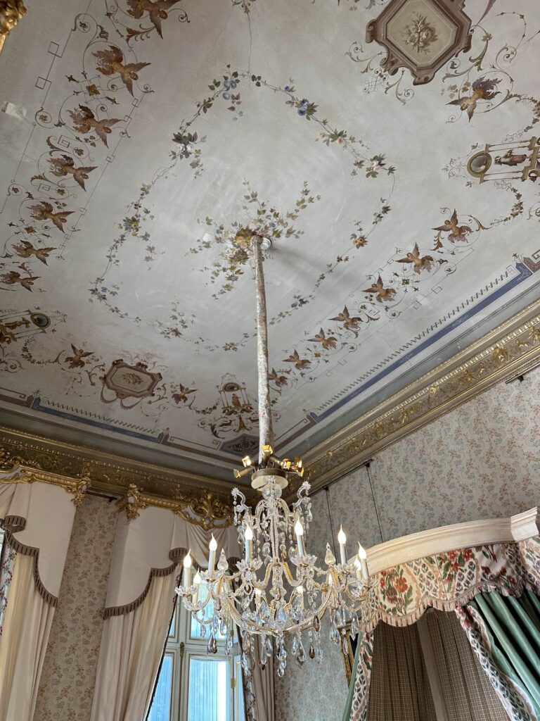
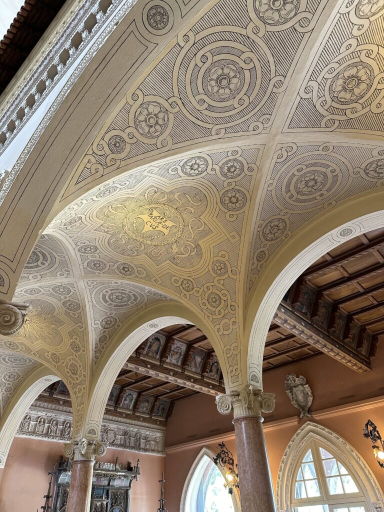
This is the throne room (below), where Grace and Rainier had their civil wedding ceremony! Look at that ceiling … Apparently, in 2014, restoration experts noticed older motifs beneath the layers of crumbling paint, painted directly onto the wall. Prince Albert II ordered closer investigations and other traces of old frescoes were uncovered in other rooms, covering a total of 600 m2. They have been restoring all the old frescoes. It’s an 8-year project and is considered one of the biggest painting restoration and conservation projects ever undertaken in Europe.
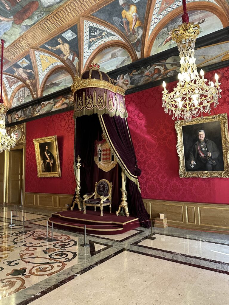
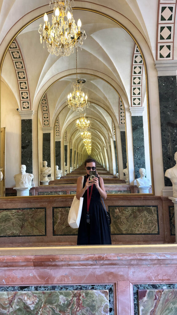
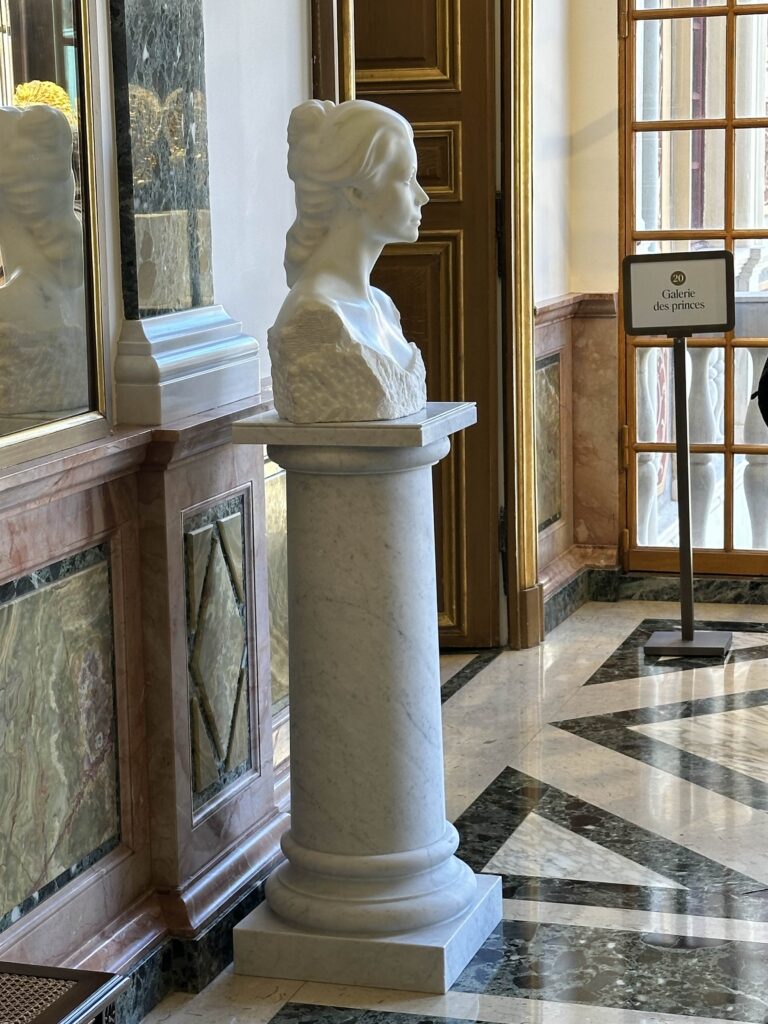
The palace has a large Mirror Gallery, an imitation of Versailles, which gives access to the state apartments. It is lined with marble busts, including a beautiful one of Grace.
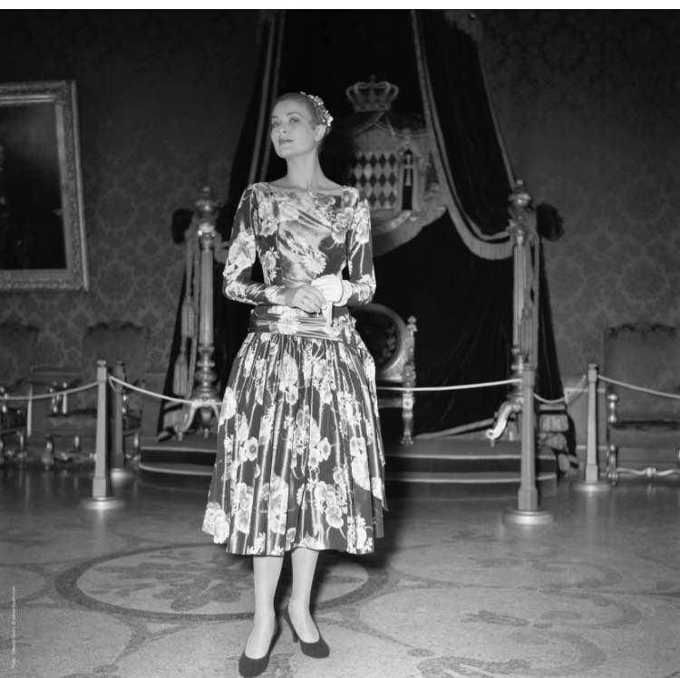
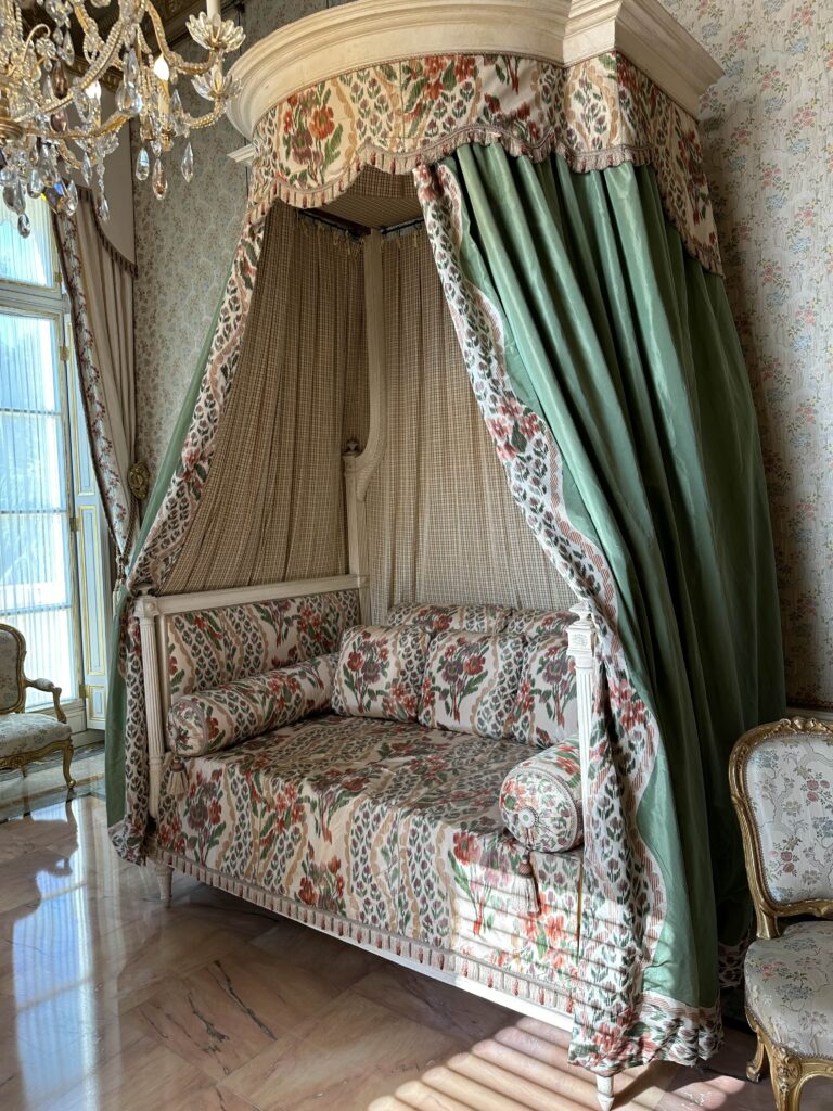
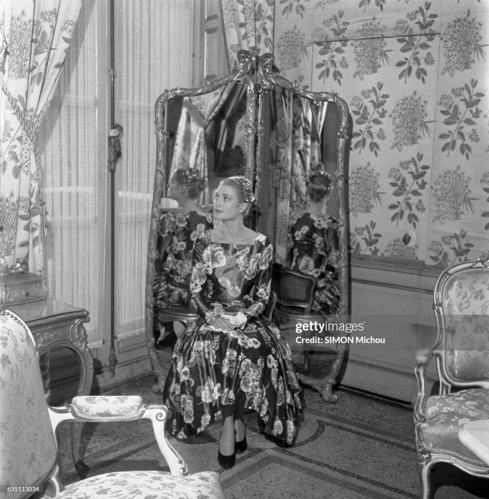
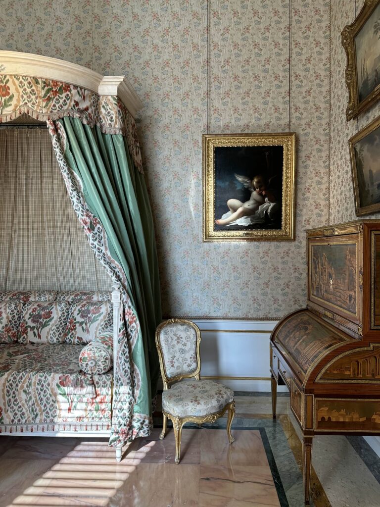
I also thought this space (below) was so charming. Pattern on pattern! It’s the Chambre Valentinois. There’s a photo of Grace in the corner from her first visit. The walls and fabrics are to die for though they have changed since her photo I was taken in the 1950s. The ceiling is just incredible too! The painting to the right of the daybed is attributed to Bartolomeo Schedoni.
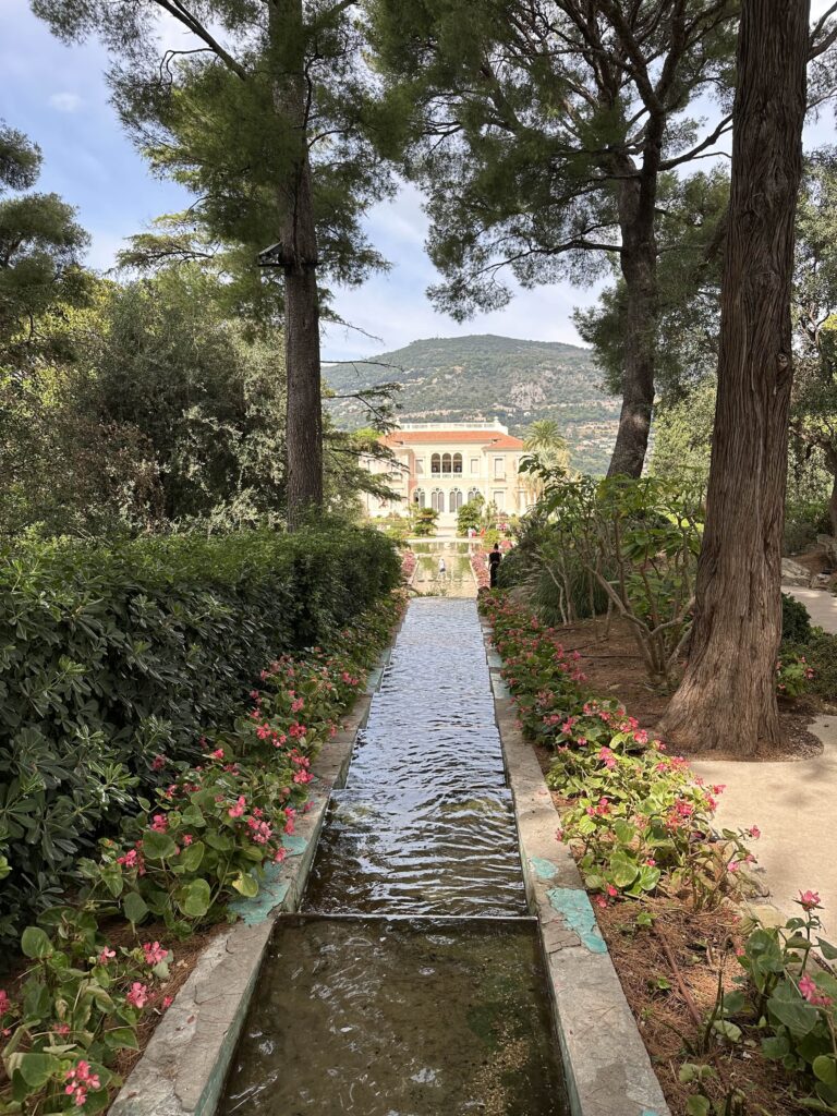
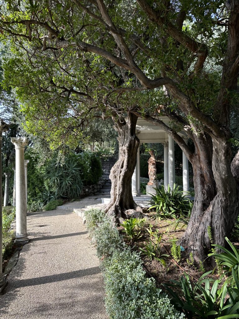
Villa Ephrussi de Rothschild
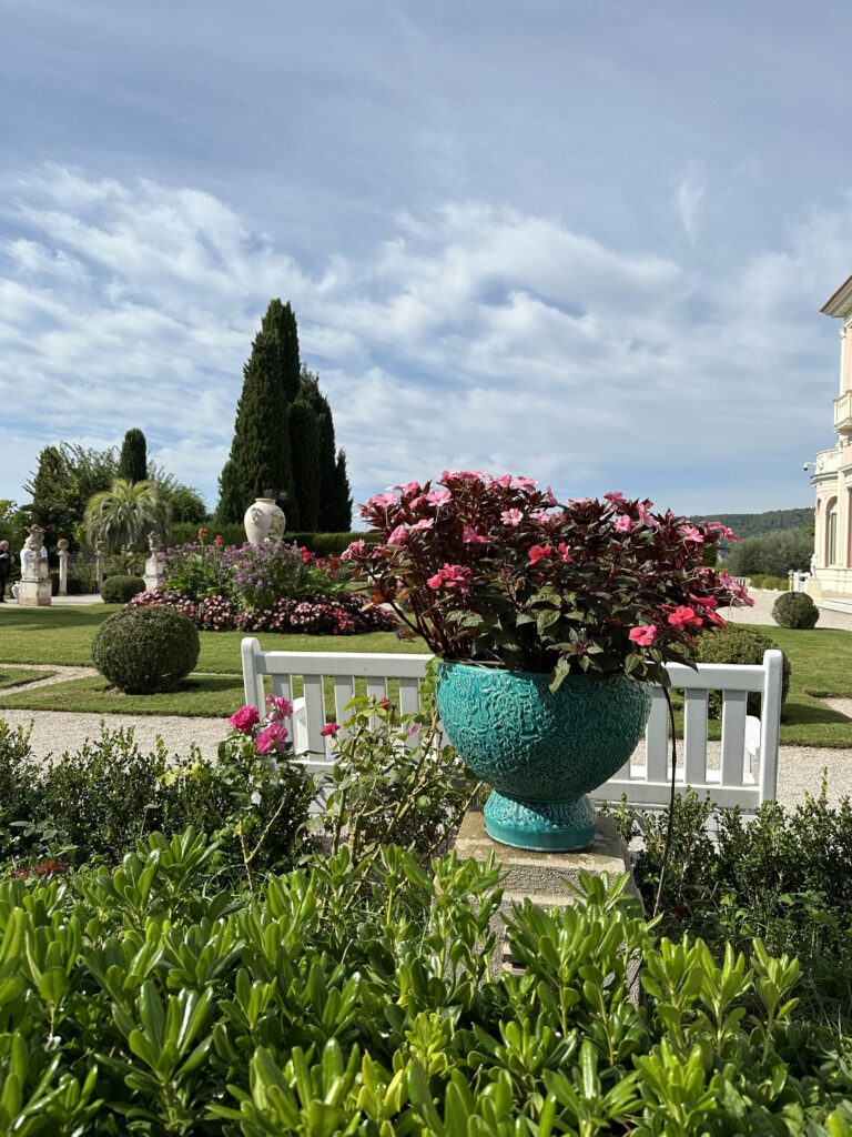
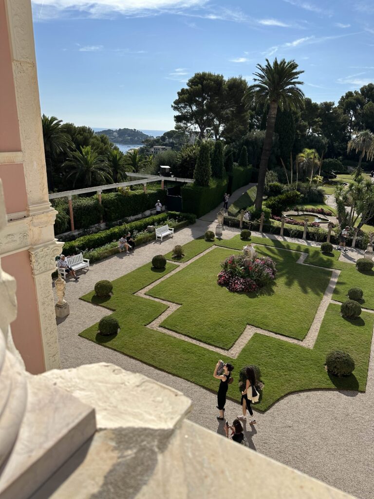
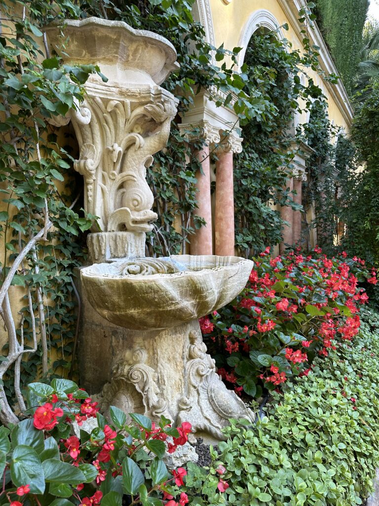
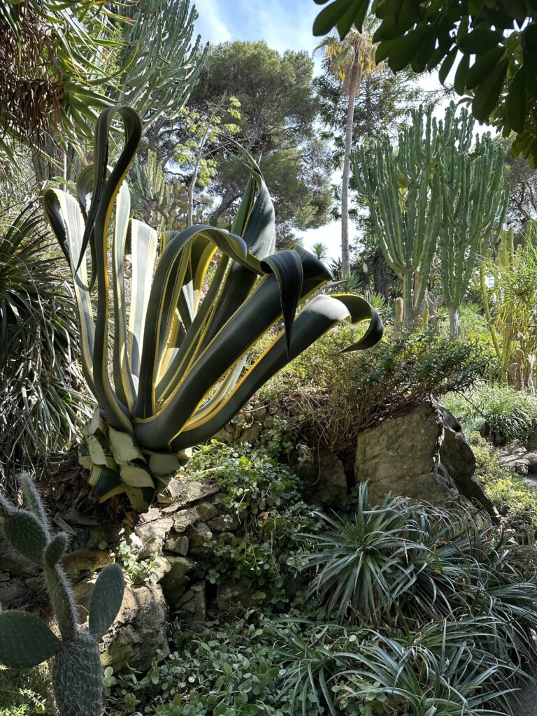
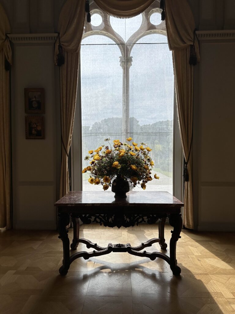
A few highlights from my visit to The Villa and Gardens Ephrussi de Rothschild. Neither photos nor words do this place justice. I stayed from open until close. Wandered the interiors and gardens, took countless photos for inspiration, sat and painted the façade and had lunch on the terrace. Simply remarkable what Béatrice Ephrussi de Rothschild created here so many years ago that we all can still enjoy today.
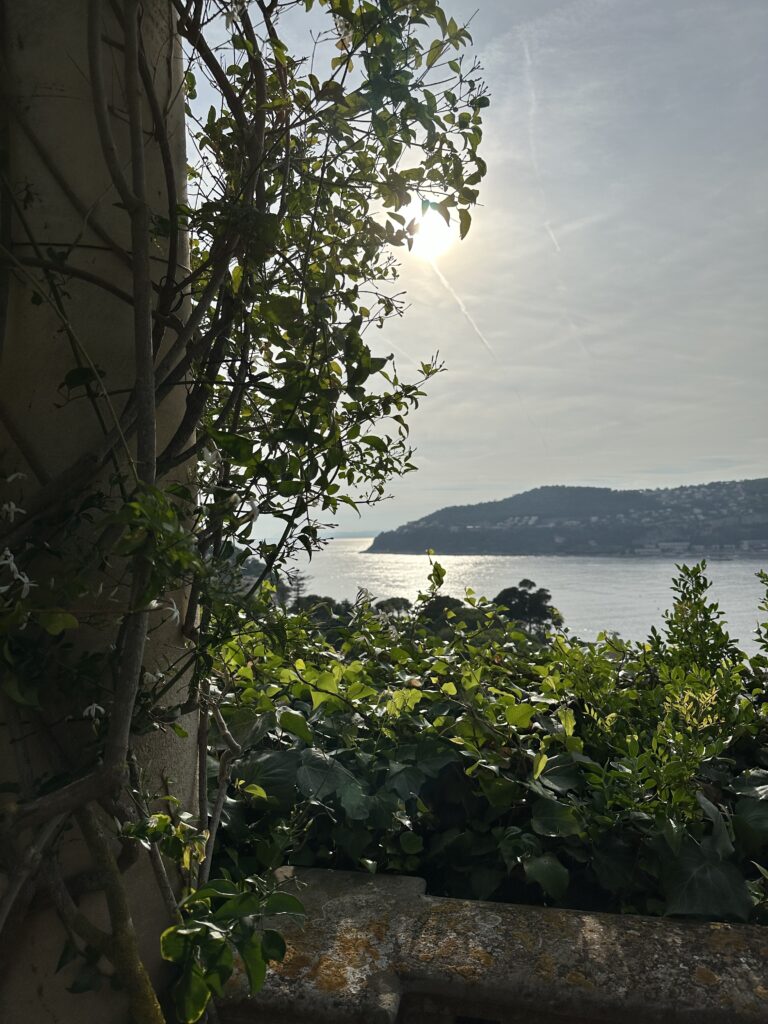
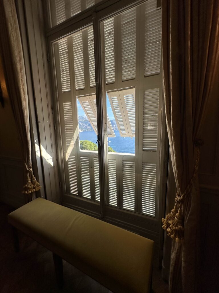
It was designed by the French architect Aaron Messiah and built between 1907 and 1912. The villa itself has been classified as a “monument historique.” The garden (visible below in the photo I took from the upper level loggia) was conceived in the form of a ship, to be viewed from the loggia, which is like the bridge of a vessel with the sea visible on all sides. It was inspired by a voyage Beatrice made on the liner Île de France.
Grace in Cannes
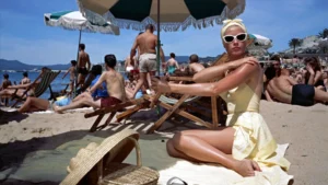
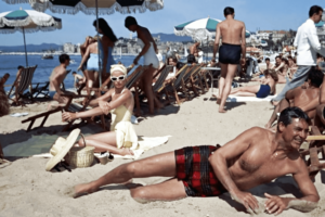
When I was little, my mom turned on old movies when my dad was out of town. We’d make popcorn and huddle around the tv, absorbed in classic films like Rear Window and To Catch a Thief, in which Grace Kelly lit up the screen. I adored her. In To Catch a Thief, her glamorous character, Francie Stevens, is holidaying in the French Riviera when she meets and falls in love with retired jewel thief John Robie, played by Cary Grant. Francie helps John clear his name and track down the real thief behind the latest string of Côte d’Azur robberies committed in his style. Spoiler: she moves into his French villa and they live happily ever after amongst the vineyards.
In one famous scene from the film, which I illustrated below, Francie is sunbathing at the Carlton Beach Club in Cannes when she catches her first glimpse of John as he is swimming ashore. Her yellow swimsuit and white sunglasses are the first of many iconic looks from the movie.
“Grace in Cannes” is available as a print (in several sizes) or notecards in my shop.

Announcing: Paulette Pearson Studio + Hunt & Bloom
I teamed up with Will Hunt Lewis of Hunt & Bloom in Houston to design a line of tea towels and totes featuring my illustrations! The launch date, product images and purchasing details will be revealed soon. In the meantime, I wanted to talk a little about the drawings I created for this collaboration. Eek!
Will Hunt has the most fabulous shop thanks to his talent for hunting down the very best pieces. He curates vintage and antique decor alongside modern wares, and I especially admire his eye for art. (I completely fell in love with Will Hunt’s booth at Marburger Farm in Round Top this year–even before I realized it was his. It reminded me of a fabulous brocante in France with so many beautiful antique plates, furnishings and other unique treasures for the home.)
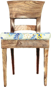
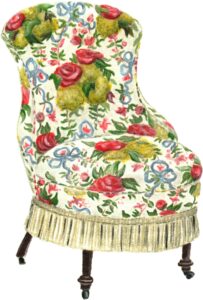
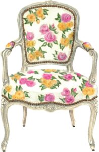
Naturally, when Will Hunt reached out about working together on a collection for his shop, I immediately said yes! He tasked me with creating several illustrations within three themes: “Easy Entertaining,” “Chintzy Chairs” and “Colorful Intaglios.” We also included a “bonus” design–more to come on that!
- For our Easy Entertaining theme, I imagined how hostesses might look and dress during the 1950s and ’60s. The Marvelous Mrs. Maisel and Mad Men both came to mind! Truly, there is nothing I’d love more than to attend a cocktail party during that era so these were a blast to bring to life. How perfect are these chic hostesses for a set of tea towels??


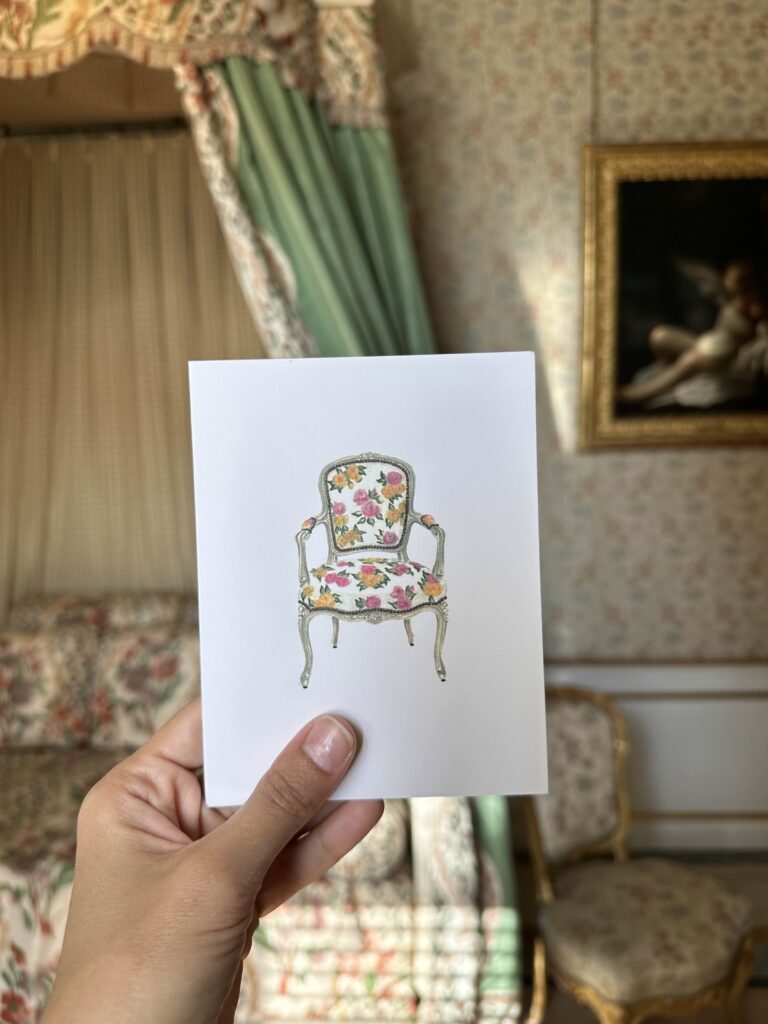
- When Will Hunt suggested we do a series of Chintzy Chairs, my inner maximalist rejoiced at the idea. I’ve never met a chintz pattern I didn’t like. I illustrated several chair silhouettes to showcase how these sweet floral patterns can bring any style of furniture to life. They have so much personality! I especially love our dark wood frame chair design with a hint of pattern on the cushion.
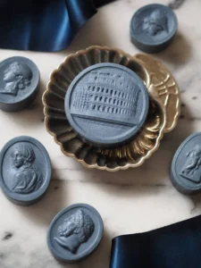
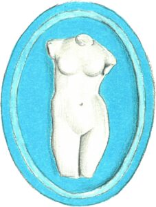
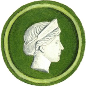
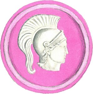
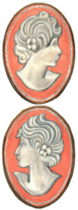
- Our Colorful Intaglio designs are a spin on the classic grand tour intaglio, but in rainbow-bright hues à la Bridie Hall! I have several framed intaglios hanging throughout my house and love the three-dimensional quality of intaglios, which I tried to get across in my illustrations. In the same vein, I also added a “bonus” drawing to this series inspired by a pair of my cameo earrings. We cannot wait for you to see! More soon. xoxo
What Kind Of Artist Am I?
People often ask what kind of artist I am. My medium has always been colored pencil, which is a bit rare I suppose. But my mom is a colored pencil artist, so I grew up standing on my tip toes at her drafting board to get a glimpse at her latest artworks. And each Christmas, my grandmother gave me new colored pencil sets. So it never really occurred to me to use anything else and it probably says a lot about my personality too, because I like the control that colored pencils provide. Maybe someday I’ll try watercolors (and bravo to those of you who do because I love watercolor illustrations!), but for now no watery messes or drips for me.
My absolute favorite colored pencils are Prismacolor Premier. I haven’t been able to find anything better! They go on so smooth, they blend well and there are a million color options. They’re a bit soft so I use a hand-held pencil sharpener as opposed to an electric one to prevent as much breakage as possible. I currently have this one and I like that it’s really sharp, which helps create a super fine point, and that it has a canister to catch the shavings. There are few things more frustrating than a rogue pencil shaving, which can mark up a clean piece of in-progress art. That being said, a dust brush is absolutely crucial to brush away any shavings or other annoying bits. Which brings me to my favorite kneaded eraser, which doesn’t shed like rubber erasers. It also picks up the color without smearing or damaging the paper and can be shaped into a point to lift out small highlights. So an eraser is as much a tool for creating the actual art as it is for erasing any mistakes. I keep all of these supplies in shoe boxes on my desk. Very professional, I know! 🙂
And lastly, I look for paper that’s relatively smooth. My favorite Canson Biggie Sketch paper was discontinued (oh, the devastation!), so I’ve been testing others. Lately, Strathmore Drawing paper (medium surface and weight) has been my go-to. I buy it in 11×14″ sheets and use a paper cutter if a client wants a smaller size.
In terms of tools for actually creating my illustrations, that’s about it! It’s really important to test things out because once you find what you like, it makes the process so much easier and reduces the guess work. I’ll post later about my scanner and printer and how I digitize my works, all of which deserve a post of their own.